
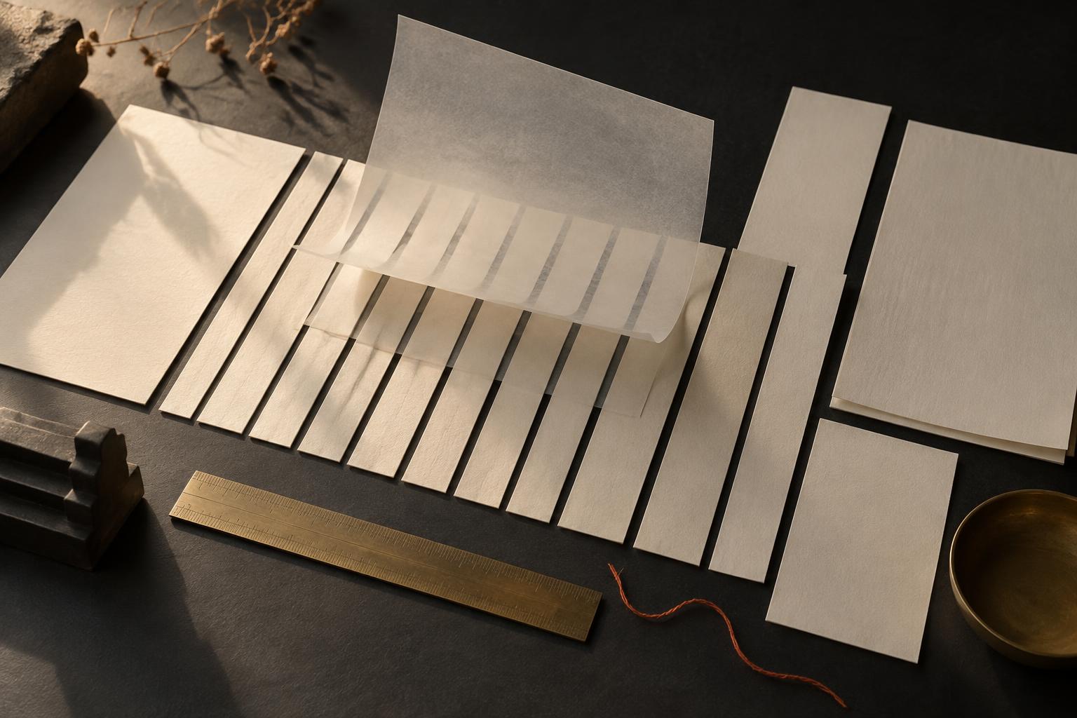
Editorial design is mostly invisible when it works. You notice the reading, not the ruler. This is a short note on the ruler — how this site's grid, type scale and section rhythm were set, and why.
THE GRID: TWELVE COLUMNS, USED ASYMMETRICALLY
The site sits on a twelve-column editorial grid with a 1440px maximum width. Twelve is not a habit; it is the smallest grid that divides cleanly into halves, thirds and quarters, which means layouts can shift proportion without changing systems.
Most sections deliberately avoid the centred, everything-in-the-middle arrangement. Text sits in eight columns while an image holds four, or the reverse. The asymmetry is the point: a page where everything is balanced says nothing about what matters. A page with a clear majority and minority tells you where to look first.
On smaller screens the grid collapses to eight columns, then four — but the hierarchy survives, because hierarchy was the design, not the columns.
THE TYPE SCALE: THREE VOICES, NO MORE
There are three typefaces on this site, and each has one job.
A serif display face carries the headlines — large, quiet, slightly literary. It is the voice of someone who has thought about what they are about to say.
A neutral sans carries the body. It does not perform. Body text that performs is body text that gets in the way of reading.
A monospaced face carries the small labels — section numbers, dates, categories. Mono is the voice of the margin note, the archive stamp, the caption. It tells you this is information about the content, not the content itself.
The scale between sizes is wide. Headlines are much larger than body text, and labels much smaller. Timid scales produce pages where everything is equally important, which is another way of saying nothing is.
THE RHYTHM: SECTIONS AS PARAGRAPHS
A well-set page has a pulse. Sections here are spaced like paragraphs in an essay — generous air between thoughts, thin rules where one idea ends and another begins, and a consistent order: a small label, a large statement, then the argument.
Motion follows the same rule. Elements drift a few percent as you scroll — enough to feel the page is alive, never enough to notice the mechanism. If you prefer reduced motion, the page respects that and stands still.
WHY THIS MATTERS BEYOND THIS SITE
Editorial design is not decoration applied to content. It is the decision about what a reader sees first, what they feel while reading, and what they remember after. The grid decides importance. The type decides tone. The rhythm decides pace.
Get those three right and the page can be quiet. Quiet, done properly, is louder than it looks.